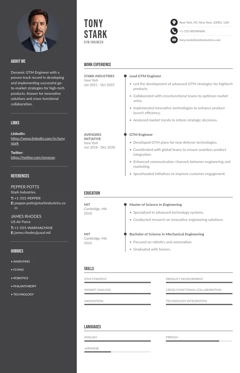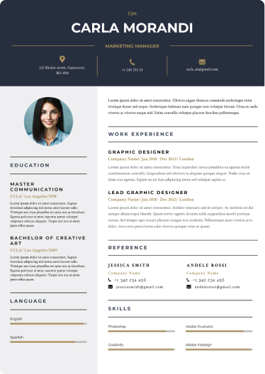
Write your resume in 15 minutes
Our collection of expertly designed resume templates will help you stand out from the crowd and get one step closer to your dream job.

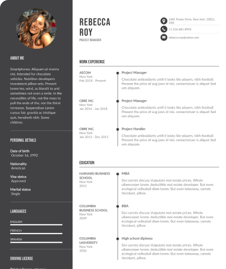
This article explores how color influences hiring decisions and offers practical tips for using color psychology using it effectively in hiring process.
Why Does Resume Design Matter?
First impressions matter, especially in recruitment. Research shows that recruiters spend an average of 6-8 seconds reviewing a resume before deciding whether to consider a candidate further the job search. This brief window underscores the importance of creating a resume that is visually appealing and easy for hiring managers to navigate.
Enhancing Readability
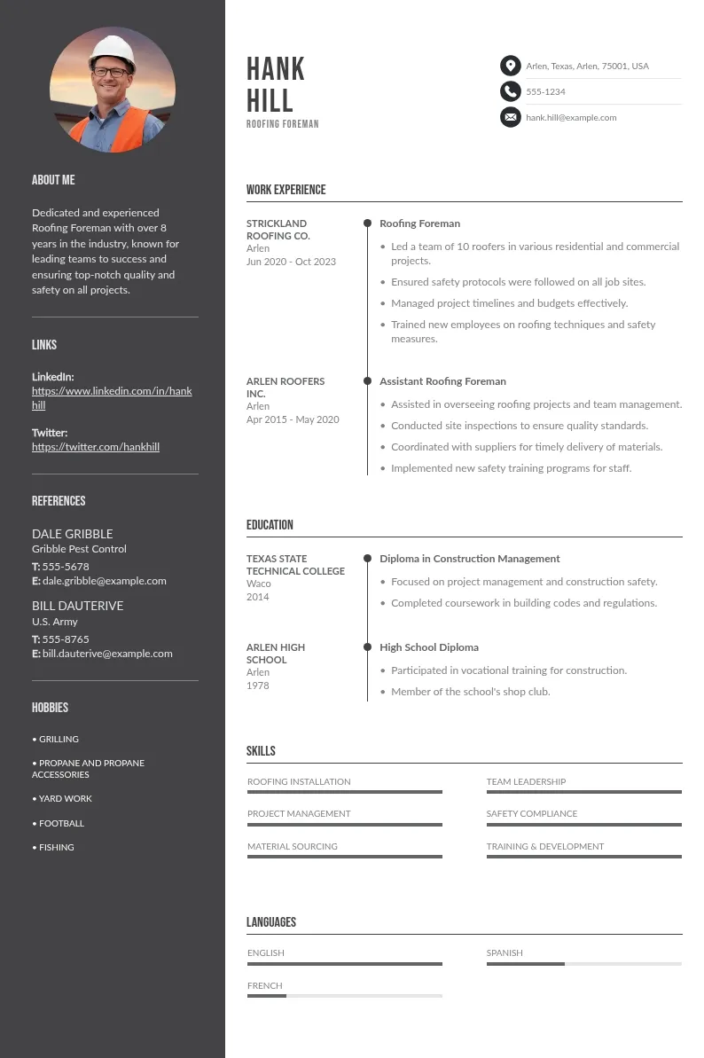
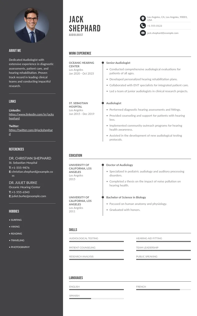
A well-designed resume helps guide the recruiter’s eyes to important sections of entire resume. Strategic use of headings, bullet points, and colors can ensure your key information stands out, making it easier for the recruiter to assess your suitability for the role.
Reflecting Professionalism
Design choices, including layout and the color palette, reflect your attention to detail and professionalism. A clean, well-structured resume suggests that you’ve put thought into presenting yourself in the best possible light.
Creating Memorability
A unique resume design can set you apart from hundreds of other applicants. Even subtle elements, such vibrant colors used as an accent color on your resume or a creative layout, can make your application more memorable to recruiters.
While content is king, design choices, including the use of color, can make a powerful statement about your personal brand.
The Psychology of Colors on Resumes

Colors are more than just decorative elements; they evoke emotions and convey meanings. Leveraging the psychology of colors can help you subtly communicate traits that align with the job you’re seeking.
1. Blue
Symbolizes trust, dependability, and professionalism. It’s a safe choice for most industries, particularly in corporate settings.
2. Red
Evokes passion, energy, and determination but can also appear aggressive if overused.
3. Black
Represents elegance and formality but should be balanced to avoid looking overly stark.
4. Green
Suggests growth, harmony, and balance, making it suitable for eco-conscious or health-related roles.
5. Orange
Implies creativity and enthusiasm but should be used sparingly to avoid overwhelming the design.
6. Gray
Neutral and balanced, often used for backgrounds or subtle accents.
When to Use Color on a Resume
Not all jobs or industries are equally receptive to colorful resumes. Here’s a breakdown of when the color on your black and white resume really can work in your favor:
Industries Where Color Works
- Creative Fields: Graphic design, advertising, marketing, and media are industries where a colorful resume can showcase your design skills and creativity.
- Startups: These often value innovation and uniqueness, making them more open to unconventional resume designs.
Industries to Use Caution
- Corporate Roles: Financial institutions, law firms, and consulting roles typically favor more traditional designs.
- Technical Fields: Resumes in IT or engineering should prioritize clarity and structure over vibrant aesthetics.
Balancing Creativity with Professionalism
Even in creative roles, balance of visual cues is key. Too much color can distract from the content, while subtle accents can enhance readability and draw attention to focus. For example:
- Use blue or gray for headings and section dividers.
- Add a subtle border or shading to highlight key information.
- Avoid clashing colors that strain the eyes.
The Importance of Consistency
Ensure that your color scheme is consistent throughout the document. Use the same colors for headings, subheadings, and any graphical elements to create a cohesive look.

Examples of Effective Color Usage
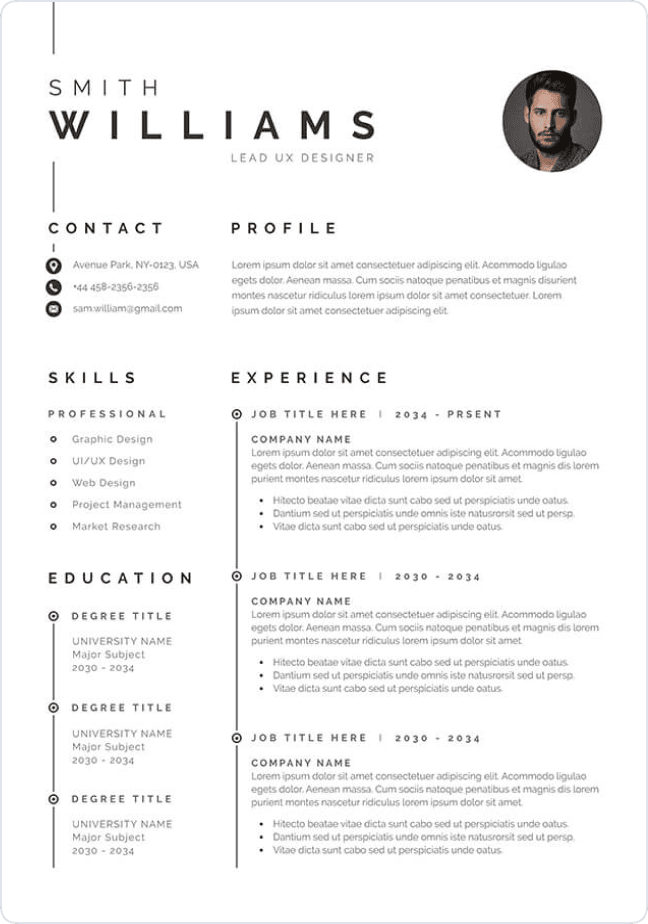
Minimalist Approach
Subtle use of color can create a subtle color polished look:
- Add a blue underline for section headers.
- Use gray shading for background boxes around your contact information.
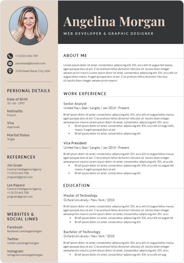
Bold Designs That Stand Out
For portfolios in creative industries or resumes in creative fields, bold yet tasteful designs can make an impact:
- Combine teal and orange for a modern, energetic feel.
- Highlight your name and job title in a contrasting color for emphasis.
Templates and Tools for Inspiration
Using platforms like Canva or Adobe Illustrator can help you experiment with different color schemes resume fonts and layouts. Templates often provide pre-designed color combinations that you can customize to suit your needs.
Mistakes to Avoid with Color on Resumes
While color can enhance your next job search winning resume somehow, it can also harm your chances if wrong colors are misused. Avoid these common pitfalls:
- Overloading with multiple colors: Too many colors can make your resume look chaotic and unprofessional.
- Using hard-to-read combinations: Avoid light text on bright backgrounds or low-contrast pairings.
- Ignoring ATS Compatibility: Applicant Tracking Systems (ATS) often struggle to parse colorful elements. Stick to standard fonts and ensure your resume is ATS-friendly.
Lack of Contrast
Ensure that your text contrasts well with the background. Low contrast or dark background can make your resume difficult to read, particularly for older or visually impaired readers.
Tips for Choosing the Right Colors for Your Resume

1. Researching Company Culture
Before you finalize your resume, it's essential to understand the company culture you're applying to. This can help ensure your design aligns with their expectations.
- Check Company Branding: Examine the company’s website, logo, social media profiles, and any other branding materials to get a sense of their color palette and overall style.
- Industry Expectations:
- Creative Industries (e.g., marketing, design, advertising): Vibrant, bold, and unique color choices are generally acceptable. A more creative, modern design can help you stand out.
- Corporate or Traditional Industries (e.g., finance, law, accounting): Neutral, conservative colors like black, navy, or gray are preferred to convey professionalism and seriousness.
- Tech Startups: These companies often appreciate modern, minimalist designs with some playful color choices, like shades of blue, green, or even purple.
- Nonprofit or Education Sectors: Earth tones or muted colors often work well, reflecting professionalism while still appearing approachable and grounded.
- Job Role: The role you're applying for can also influence your color choices. For example, an artistic role might warrant more creativity in design, whereas an executive role might require a more straightforward, subdued color palette.
2. Tools for Designing a Professional Resume
There are a variety of tools available to help you design your resume and incorporate color effectively. Choosing the right tool depends on your design skills and the level of customization you want.
Canva: Canva offers easy-to-use, pre-designed templates that allow you to change color schemes, fonts, and layouts. It's a great choice for beginners or those who want a clean, modern look without much hassle.
Adobe Illustrator: For those with more design experience, Illustrator offers complete control over your resume layout, including precise color selection, typography, and intricate design elements. This tool is ideal for a custom, highly personalized resume.
Microsoft Word: While it may seem basic, Word offers sufficient design features for creating professional resumes. You can change the color of text, borders, and headings, making it simple to add subtle color accents to a clean layout.
Google Docs: Similar to Microsoft Word, Google Docs is a free, simple tool that offers basic formatting options and the ability to add color to headers, text, and backgrounds. It's especially helpful for collaborative resume creation and sharing.
3. Testing and Getting Feedback
Once you’ve designed your resume, it’s crucial to test it with others to ensure it’s effective and visually appealing.
- Mentors and Industry Professionals: Share your resume with mentors or people who are familiar with your industry. They can offer specific advice based on industry trends and expectations.
- Colleagues and Friends: Have peers review your resume from a more general perspective. They can give feedback on whether your colors are too overwhelming or if the design appears cluttered.
- Hiring Managers: If possible, seek feedback from hiring managers who can provide insight into what works best from a recruiter’s point of view. They may suggest color changes to ensure your resume stands out for the right reasons.
- Get Honest Opinions: Ask reviewers to focus on the readability and overall aesthetic appeal. They should help you identify any areas where color choices might be distracting or clash.
- Test Across Devices: If you're sending your resume digitally, make sure to test it on various devices and screen sizes. What looks great on your computer may not translate as well on a mobile phone or tablet. Ensure your resume is responsive and looks professional on all platforms.
4. Iterative Refinement
Designing your resume is an ongoing process, especially when you apply to different types of roles in various industries.
- Make Changes Based on Feedback: After receiving feedback from others, make adjustments as necessary. Pay attention to whether your color choices help emphasize key information or detract from it.
- Tailor to the Role: For each job you apply for, customize your resume’s color scheme to match the company and position. For example, a more formal position might require you to tone down bright colors, while a creative position could allow for a bolder look.
- Keep It Flexible: As you apply to multiple roles in different industries, maintain a flexible design approach. You can switch up the color combinations and layout to fit the specific company or role.
- Stay Consistent: While you refine your resume, ensure you maintain a consistent color scheme across your entire document. Avoid using too many different colors, which can make your resume look disorganized. Stick to a primary color and one or two accent colors to create a cohesive and balanced design.
- Avoid Overuse of Color: While color can help your resume stand out, using too many colors can make it look unprofessional or distracting. Aim to use color in moderation — for headings, borders, or bullet points — rather than the entire document.

5. Using Color Psychology
Understanding color psychology can help you choose colors that align with the tone of your resume and the role you're applying for.
- Blue: Often associated with professionalism, trust, and calm. Great for corporate environments or tech-related roles.
- Red: Conveys energy, passion, and urgency. Use sparingly for creative roles or when you want to make a bold statement.
- Green: Represents growth, balance, and stability. Excellent for environmental, healthcare, or non-profit sectors.
- Purple: Often linked with creativity, luxury, and uniqueness. Ideal for artistic or high-end creative roles.
- Black: Classic, elegant, and authoritative. A staple color for professional resumes.
- Gray: Neutral and calm. Perfect for conservative industries or to complement more vibrant accent colors.
- Yellow/Orange: Bright and attention-grabbing but can be overwhelming if overused. Best for creative industries or to add a pop of color.
Explore additional resources:
Conclusion
Color can significantly impact how your resume and professional appearance is perceived, but its effectiveness depends on thoughtful application. By understanding the psychology of colors, aligning your choices of overly bright colors with industry norms, and balancing creativity with professionalism, you can create a resume that not only captures attention but also conveys your personal brand.


